Showing posts with label painting. Show all posts

8.31.2012

A Master Bedroom sneak peak....

I promised a full master bedroom reveal post....and I'll get there....eventually. Once the room is "done". For you smartie pants, you have caught the catch here. The room is never really done, right? Sidenote: why do these projects always seem to take longer than you think?

Before you continue reading, be sure you go back to the before pics in this post.

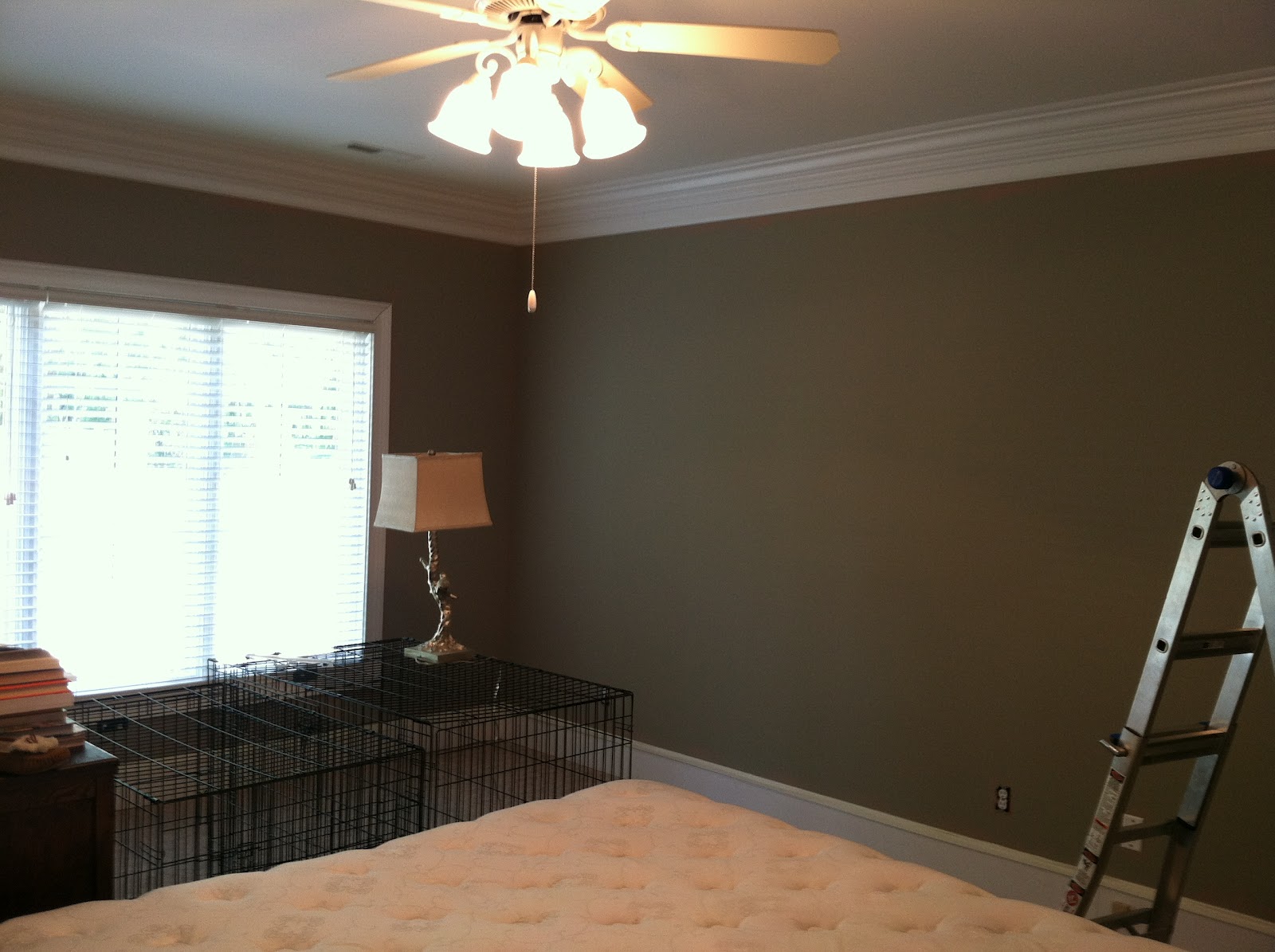
Here are a few in progress pictures so you get an idea of the enormity of this transformation:

Primer coat
 
Primer again - before the real color
 
Primer (still drying) contrasted with the old color


I think it's pretty fair to say that the primer coat alone gives you an idea of how drastic and much needed this change was. I'm in love with the final outcome. The color is relaxing without being bland and neutral while still being bold. We ended up going with, no surprise here, my go-to color, Valspar Smoked Oyster at 75%. It looks different, in a good way, than it did in the kitchen at the last house, and I love that this has a more gray base rather than the brown shades in the kitchen. It just goes to show you how different lighting can impact the final results.

I'm waiting for a couple pictures to get framed and then I'll be able to pull together the last details of the room to share with you. Be patient with me, I think it'll be worth it!

8.23.2012

That time I painted my kitchen...

It's long overdue, but I owe you guys an update on the master bedroom/kitchen painting situation. I'm saving the master bedroom for a separate post. I love the color - it turned out fantastic. Add in some new bedroom furniture (big kid style), new bedding, lamps, accessories, etc, and I think that's a reveal post of its own, don't you?

The kitchen, on the other hand. Ehhhh, mehhhh. I suppose this post can be filed under the "glad it's done but I'm not thrilled with the outcome" section. Let's be honest, I know some of yall liked that yellow, but believe me when I tell you a/ the pictures didn't do the horrific-ness justice and b/ it just wasn't us. It had to go. But did I make the right replacement choice? The jury is still out.

I decided to go with Valspar Frappe at 50%. In it's original formula, it had strong green undertones and was way too dark. I tried a sample at 75% and that was still too dark. I ventured to Lowes again for the 50% sample and decided that would do.

Overall, I'm happy the yellow is gone but not entirely pleased with this choice. I think it's a little bland and I'm not sure it works with the cabinet colors. It'll do for a few years until I find something that really strikes my fancy. For now, it's neutral enough that I hardly notice it day-to-day (unlike the yellow) and perhaps most importantly, it's not too overpowering at night when the paint colors throughout the house seem to become electric.

Warning: these photos are totally unedited and I'm not professing to be a professional photographer. I just snapped them quickly as I was writing this. That meant a quick clean/tidy of the kitchen. However, you'll still get a lovely glimpse into a day in the life of Mrs. B.

Dining table area
Yes, that is a light bulb that needs to be replaced, and yes, I need to fix the slipcovers.
Hi Clemmie!
 
Looking over the island. You can get an idea of the contrast with the stone.
Stupid light bulb.
Side note: what should I do with that TV mount on the right side?
I need to find pictures to anchor both sides of the window....
 
From the dining table looking over the island
Ignore the pile of junk on the far left - that's Mr. B's stuff.
Not sure how the color works here against the cabinet color.
 
Similar view as before.
I spy a bedside table lamp that may or may not be included in the MBR post!
Darn slipcovers....
 
The laundry room
 
The pantry looking a little sparse since I haven't been to the grocery in, um, ages.
Have you met my OCD husband who arranges everything label forward?
 
In conclusion, I'm mostly just relieved that this project is done before baby arrives and I lose track of days/months/years before I have a chance to do anything home-related again. Going forward, part of me thinks I have waited until I was absolutely 100% sure about a color - and I would recommend that to you too - unless you have this looming little deadline like the arrival of a new baby which will likely derail most home decor projects for an undetermined period of time.
 
Anyone else have a painting experience that borders on disappointing rather than exhilarating? Surely others have made these mistakes before?
  

7.24.2012

Under the Tuscan Sun

Anyone else remember that movie? I don't even like chick flicks but that one was good.

I wish this post was about us jetting off for a month-long summer holiday in Tuscany, but sadly, not this year. (We have, however, done Tuscany in November and I would highly recommend it.) Instead, this post is about more paint drama here at The Anniversary Home.

The problem this time? This "Tuscan Yellow" theme we're rocking in the kitchen. At first, I thought I could live with it. I like yellow, but as a paint color, I think it's especially hard to get it right. I was willing to give this a few weeks to see how the color looked in the morning and at night. And it's safe to say now this is not the right yellow for us.


Shoot, even as I post these pictures, it doesn't look too bad, so you're probably thinking I'm overrreacting. But please trust me on this one, it doesn't work.

The issue this time around? I have no idea where to even begin picking a paint color for this room given the cherry cabinets, the gray stone work and the light wood floors. Sheesh, there's a lot going on. Tons of warmth from the cabinents countered by coolish tones from the stone and I'm just stuck.

For all you color experts out there, do you have any ideas? I'm not so much looking for specific paint color recommendations, although that would certainly help, but rather just some ideas. I've tried pinterest and google for inspiration and got as far as nowhere. Lots of people have gone with greenish tones with their cherry cabinets to use a contrasting color theme, and that might work given the grayish tons in the stone...? I'm absolutely at a loss.

Time is of the essence again folks as our painter starts on August 1st which means I need to start getting my samples now. Help!?!

7.16.2012

Paint Color CRISIS!

As predicted, one of the perks of moving into a brand new home is that, well, there's nothing that really needs to be "done". This current home was the definition of move-in ready. To be fair, I suppose I'm comparing two extremes. Let's face it, the last Anniversary Home was a wreck and we would have easily spent the next 10 years of our lives renovating that place with little to show for it.

Of course, there's things to be done to make it our own. We still need furniture is certain rooms, there are DIY / crafting projects I'd like to tackle, and perhaps most pressingly, the nursery.

But before I can fully give my attention to any of those projects, there is one HUGE eyesore that needs to be remedied stat. Remember the Master bedroom and bathroom?


If you don't immediately see what I'm talking about here, you need to adjust the color settings on your computer. And if you think there's something wrong with the color settings on your computer, no worries friend, this paint color really is that offensive.

I'm wise enough to know that if this doesn't get painted soon, before we get too comfortable and the baby arrives, it'll be years before it gets done. And because this color is so electric it actually is hard to fall asleep in this room at night. Ladies, can you even imagine putting your MAKEUP on in this bathroom? No wonder I always look like a hot mess. I can't bear the prospects of dealing with this stress for any longer than is physically necessary.

I've had painters in for quotes - I'm also giving the kitchen a new paint color (more on that this week) - and we're scheduled to paint on August 1st. That's just around the corner. Because some things never change, we're back to picking paint colors.

I've always been an advocate of painting your samples on white poster board rather than directly on the wall you'll be painting for this exact reason. There's no way anyone could make an sound choice when you're working with that orange/pink/red as a backdrop.

So here's where I need your help. I know it's difficult to pick paint colors from this photo, but would you mind please leaving your vote in the comments? Mr. B and I have it narrowed down, but it'll be interesting to see if your comments serve as a much needed tie-breaker.

Here's the list of colors:

On the left:
1. Benjamin Moore Light Pewter
2. Benjamin Moore Abalone
3. Sherwin Williams Ancient Marble 
4. Olympic Georgian Silver

On the right:
1. Benjamin Moore Silver Fox at 50%
2. Valspar Smoked Oyster at 75% (remember this color from the kitchen & dining room???)
3. Benjamin Moore Hampshire Taupe
4. Valspar Frappe

Thanks in advance friends - your help is much appreciated!

10.10.2011

Foyer / Hallway: Before & After

A few weeks ago, when Mr. B and I were on vacation, we had painter come in and work his magic on that awful charteruse/lime green in the downstairs foyer and upstairs hallway. You're probably thinking: "Who in their right mind leaves their house for two weeks to a painter?" We do. Because he's our neighbor directly across the street. Russ is just an all-around good guy.

It made sense to have him do all the work while we were gone. He didn't have to worry about cleaning up for us each night, and we didn't have to live in a worksite full of paint fumes. Double bonus that when Hurricane Irene and Tropical Storm Lee hit, Russ was able to keep an eye on the house for any shenanigans or trouble. Thankfully, this little beast weathered the storms just fine. I'd expect nothing less from a 120 year old house! 

We wanted something simple and neutral, and in all honesty, we were so down to the wire with packing and prep for the trip we sort of forgot to pick colors. When in doubt, trust what's worked before: Accessible Beige by Sherwin Williams. (The same color as the office with the board and batten. Which BTW, 6 months later and I'm still obsessing over this room. I love it.) So yes, nothing earth-shattering. But after that green, we needed some respite and calm.

Here's the before and after:


Just looking at these before pictures gives me the heebie jeebies. And can you see the old kitchen in the bottom left corner of the before picture? Goodness knows whatever possessed us to attempt this project. Clearly, Mr. B. has some serious powers of persuasion (must be that accent!) because Seriously, we bought this house with green walls.


Forgive the "makeshift" decoration in the after photo. You know me well enough to know I've got my eye on a certain table/buffet/storage piece for this spot but it's out of my price range. I'm continuing to hunt around (and check PB each week for a clearance) so this works in the meantime.

Interestingly enough, that table is actually a "games table" (as Mr. B. calls it) which is great-grandfather made back in jolly ole England. The four triangles fold out to make a nifty little poker table. It's a special piece to have, but like I said, it's a temporary fix for the foyer. We'll find a more appropriate spot for the games table other than the foyer!

Oh, and the rotary phone? That was Walter's (the previous owner. We're on a first name basis.) It's still got the old landline number in his handwriting written on the top it.


We joked about this being the Christmas shot. Green + Red = Year round holiday goodness! I love the holidays as much as the next girl but there is such a thing as too much Christmas. I've lived to tell about it.


And finally, the upstairs landing between the 2nd and 3rd floors. Still need to replace that ridiculous light fixture but again, small wins here: the green in gone AND that awful 70's carpet is gone too. You can thank Mr. B. for that one. (And remember how I mentioned a trip to the ER last weekend too? You can thank the 70's carpet for that one.)  Need window treatments and a little decoration and we're in business. 

Russ also painted the master bedroom, but I'm not quite ready to reveal those pictures yet. The 70's carpet is still lurking around in there and it's not really an after until that stuff is gone. Forever.


8.19.2011

Kitchen Renovation Day 65

Happy Friday blogger friends! Are yall as happy as I am it's almost the weekend? We've got a pretty jam-packed weekend which includes dinner with friends, house projects and packing for our vacation next week. I've always been a to-do list girl and I'm in to-do list overdrive lately. We've got two weddings in two weeks plus a family vacation at the lake in between. Must. Be. Organized.

Thanks for all your kind comments from my last kitchen update post about the granite being installed. We are beyond thrilled with how it's turning out. The guys have been hard at work painting the walls and the windows and it's just starting to really come together. I love it.


It's already been so nice to have a functioning island and we're not even officially using the kitchen yet. I came in the house the other night (we always use the back door) and had my purse, laptop, several bags of groceries, etc. The island was calling my name and you know what happened. Everything got dumped there. Of course it was all put away in due time. It was nice just to have a place for things.

Hello pretty paint color

Like every room we've painted, I'm now obsessed with this paint color. As you can see on the far left, we had seven - count em - seven - paint samples we were working with. To be fair, several of these were up for consideration for the foyer. Oh, I can't keep a secret if I tried. The foyer and it's crazy lime green walls are halfway transformed. Those pics will come later. We're here for the kitchen.

This color is Valspar Smoked Oyster at 75%. It goes beautifully with the cabinets, the floor, the granite, everything. Not too dark. Not too light. I can only take partial credit for this color. Andrew and Alexa made the final decision and I am so glad they chose Smoked Oyster. (Folks - if you don't have a graphic designer in your life - you really should get one! Miss Alexa has an amazing eye.)


The columns are in and I'm really not sure about them. I hope they grow on me but I'm not really sure if they fit. Perhaps it's too early to tell.

But moving swiftly on, the Smoked Oyster color continues into the dining room, although it's difficult to see it here because it's dusk outside. (Lie. It's difficult to see because Mr. B has still not fixed the light fixture in the dining room. Oh well. Maybe someday we'll have light in there.)


I regret ever doubting I'd love the chocolate colored island with the wall cabinets. I love it. It's a great contrast with the countertops and gives the room some depth so it's not just a sea of cream colored cabinets. And there's going to be tonsssssss of extra storage in there.


The window sill has been raised and looks great from both the inside and the outside. And the sink looks great too. More on that later. You'll notice the backsplash underneath the cabinets is not painted because it's going to be tiled next week. Pretty, clean, white subway tile. Can't wait to see that.


The taps aren't in yet, but hopefully next week. I love how they've put the granite around the sink. There's a formal word for it - overlay perhaps? - but who cares. I like it!


And finally, the view from the sink looking in to the dark dining room. I promise I'll get better pictures of the paint color in there. Once there's a light fixture. Which reminds me....I think we were supposed to pick one out for them to install? Eeek. Suggestions friends? I'm at the end of my decision-making patience.

Hope yall have a great weekend!

7.22.2011

Kitchen Renovation Day 41

Bam. Finished!


Alright, not so much finished, but seriously close. Is that a beautiful sight or what?


Now, obviously, this stuff is not in "final" position. But our man arranged everything for us today to get an idea of how it will all look when it's "really" in. And, to make sure we've left enough space in the walkways / paths for cabinet doors to open, etc. Duh. That would be smart. This is why we do not attempt to do this ourselves.


I'm still a little nervous about the chocolate island. If yall love me as much as you say you do, you won't dare prey on this little inkling of hestitation I have festering in the back of my head that it's not going to look right. The granite will tie it all together...right?


I tell a lie. There's still a ton to do. Those pesky windows still need to be replaced. Bonus points for the person who saw that the window on the left is lower than the counter!


The skyscraper on the left is the pantry. Not the giant, walk-in butler's pantry I've dreamed of, but hey, I've got a place to store stuff and that's all that matters. :::Shutters back to the memory of the old kitchen with three measley cabinets:::  wait. :::Remembers new kitchen still has limited cabinet space but is quickly comforted by thought of pantry:::  Ahhh.


Surprisingly, I haven't started obsessing about what color to paint the walls in the kitchen / dining room yet. For the first time in months, my purse has been paint swatch free, and it's kind of liberating. We'll probs hit up Lowes this weekend and that will be enough to set me back into full blown paint color obsession mode. Strangely, I'm okay with that....

7.20.2011

Kitchen Renovation Day 37

Last week was crazy folks. Mr. B and I seem to be like ships passing in the night. Aside from the daily phone calls to touch base, I don't think we had a "real" conversation until the weekend. Meanwhile, we have a kitchen renovation in full-swing and lots of blogger friends and family who need updates! (But honestly, if I hardly have enough time to talk with my husband, the blog sure isn't getting any attention either.)

So when we were both finally home on Saturday, we were pleasantly surprised to find the walls are up and painted. Not our paint color, but a plain white. It looks clean and pretty. I'm happy. 

(Please ignore the boxes! Those will soon be gone!)


And we finally made a decision on the granite too. I'm very much a "make a decision and stick with it" kind of girl. I have no trouble pulling the trigger and often times trust my gut instinct. This entire kitchen project could have been a complete disaster if both Mr. B and I got overwhelmed and distracted by ALL the choices. Between lights, cabinets (color, wood, style), floor, appliances, fixtures...I am sure I missed a bunch of stuff, but you get the headlines.

But the granite was freaking me out. Don't know why but I was stressing about this one. Hope you like too:


My photography skills always leave something to be desired, and granite is especially tricky for the camera. Long story short, it's a white/cream base with flecks of brown, gray, black, beige, etc. Neutral enough to blend in with everything but bold enough to make a statement. Or so I hope.


4.08.2011

Before & In-Progress: Office Photo Dump

The only thing stopping me from this post was trying to think of some witty, engaging, relevant text to accompany the pictures from the office re-do. Well, that and the fact there's been no time to write it. Hello, JESSIE SPANO.

I can officially say that I'm fresh out of witty, engaging, relevant ideas. My best ideas happen in the shower in the morning or on the drive home from work in the evenings. I've had a shower every day this week and a drive home every night this week. I got nothing. Nada.

Plan B? Just post the darn pictures. No editing this time. The place was a worksite and that's what your gonna get. Like it or not. But I know you will so I can pretend to be tough. Enjoy!

Another view of room from Mr. B and Mama H's first day on the job.
Note the walls are without paint. Yeah. That'll come back to haunt us.

The other side of the room. Working around the radiator = not enjoyable.

Apologies for the shadow, but isn't the morning sunshine lovely?
TAH is not really known for her "natural lighting" even though there's a ton of windows (Try 33. Window replacement quote gave me severe anxiety.) I take what I can get with sunlight!


Wouldn't be a room redecoration without Mr. B and his cup(s!) of tea!

Paint color test. We ended up using 2nd from left: Accessible Beige, Sherwin Williams.

It was snowing on April Fools. Cruel, cruel trick Mama Nature!

Because every worksite needs a box of Cheez-Its.
(I like calling it a worksite for some reason? I recognize that usually worksites are where skyscrapers are built, but this is the closest I'm going to get to that, so indulge me please.)


Paint is drying here, so may look uneven to the untrained eye!

Accessible Beige is probably the lamest paint color name I've ever heard. Way to really sell me.
But I LOVE this color. Light, airy-fairy, and not too "beige-y".


And that's where the photo fun stops. I got tired of painting, closed the door to the room, and haven't really looked at it in a week. We still need one more coat of white paint on the bottom.

If you ever attempt this project - and you should because its easy - do yourself a favor and paint the bottom white before you put the boards up. DUH.